TL;DR
To choose an illustrated edition of Frankenstein, first check whether it prints Shelley’s 1818 or revised 1831 text, and confirm that it contains the complete novel. Then preview the artwork, notes, and physical format: illustrations are later interpretations, so the best edition depends on whether you want a faithful reading copy, a study text, or a display-worthy art book.
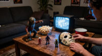
The creature in your copy of Frankenstein may have a flat head, heavy boots, and bolts at his neck. That familiar silhouette comes largely from later stage and film adaptations; Mary Shelley’s novel never gives him that standard look. In an illustrated edition, every image asks you to see the story a certain way.
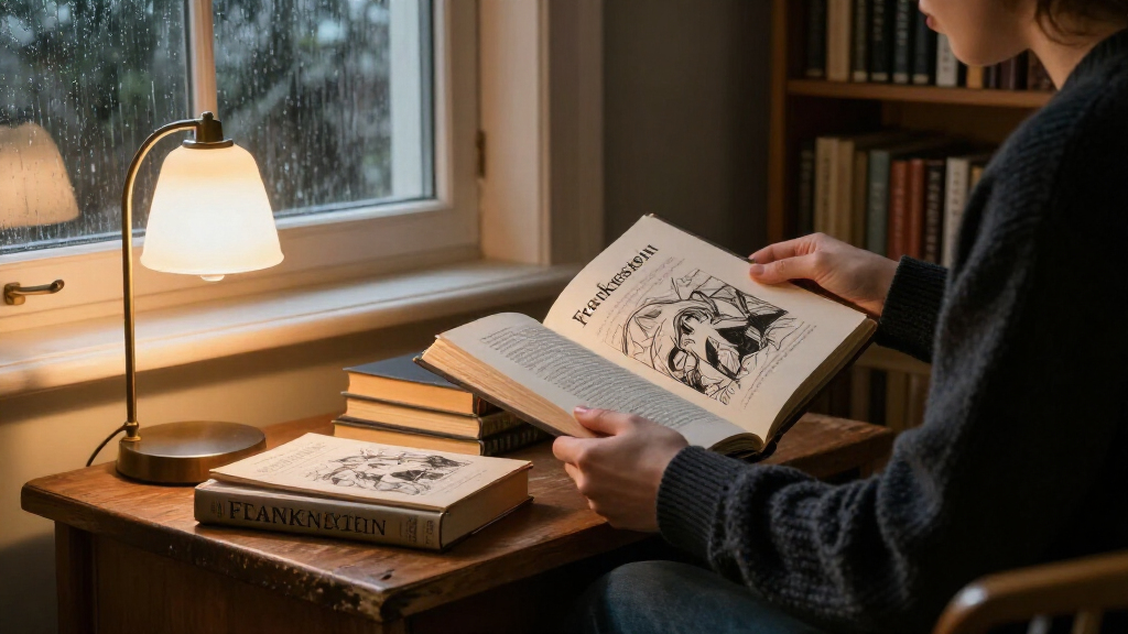
That makes choosing a copy more interesting than picking the darkest cover. You’ll want to check whether it prints Shelley’s 1818 text or her revised 1831 version, whether the artwork suits your reading, and whether the book’s notes and binding fit your plans. This guide walks you through those choices, whether you want a novel to read by lamplight, an edition to study, or a striking book to display.
Check whether the edition prints the 1818 text, the revised 1831 text, or both; the versions differ in characterization and tone.
Shelley’s first edition had no illustrations, so treat each later artist’s image as an interpretation of the novel.
Verify that the book contains the complete novel if you want Shelley’s prose rather than an adaptation or abridgment.
Preview the art, notes, type size, binding, and dimensions against the way you plan to read, study, give, or display the book.
For a collectible or rare copy, confirm the publication details, condition, and any signed or limited-edition claims.
Reader’s field guide · Illustrated classics
How to Choose an Illustrated Edition of Frankenstein
Start with Shelley’s text, then decide what you want the pictures and physical book to add. The strongest choice fits your purpose: reading, study, or display.
Every image is a later artist’s interpretation.
The 1818 novel appeared without illustrations. Let the artwork enrich the reading without mistaking it for Shelley’s visual design.At a glance: five checks that make the choice
A beautiful cover is only the beginning. Check the text, artwork, completeness, reading comfort, and edition details.
Identify the 1818 text, revised 1831 text, or an edition containing both.
Read images as later interpretations, not illustrations from Shelley’s first edition.
Confirm it contains the complete novel if you want Shelley’s prose.
Preview art, notes, type, binding, and dimensions for your intended use.
For collectibles, verify publication details, condition, and edition claims.
Follow five checks before you buy or borrow
Move from what the book contains to how it will feel in your hands.
Choose the text version before you fall for the artwork
Both versions can make a satisfying first read. Their differences matter when you want to study how Shelley revised the novel.
The first published version
Published anonymously, this is the text closest to the novel’s original appearance. Choose it when you want to read the first version Shelley brought to readers.
A substantially revised text
Shelley revised characterization and tone and added a new introduction. Look for an explicit text date, editor, or statement of editorial basis.
For a first encounter, either version works. For a class or reading group comparing the novel’s development, seek a volume that prints both or clearly identifies its text.
Read the pictures as an artist’s interpretation
Different visual choices can shift the story’s mood and your sympathies. Preview sample pages to see what the book asks you to notice.
Gothic atmosphere
Deep shadows, wintry distance, and stark landscapes can make dread feel close at hand.
Science & ambition
Instruments, laboratories, and solitary rooms can foreground the act of creation and its cost.
The creature’s humanity
A turned head or lone figure may draw attention to isolation, feeling, and the desire for connection.
The flat head and neck bolts come largely from later stage and film adaptations. Shelley’s novel describes the creature but does not give him that standard movie-monster look.
Match the art style to the reading experience you want
Art can complement the prose or steer it. Look at how often images appear, what they depict, and whether captions explain the choices.
Engravings
Fine lines and dense shadows can give the pages the atmosphere of an old print collection.
Paintings
Color and expansive scenes bring landscapes, laboratories, and dramatic moments into view.
Contemporary art
Sparing details and bold accents can make the story feel intimate, strange, or newly immediate.
Sequential art creates its own pacing. Check whether the book preserves Shelley’s complete prose or retells the story in comic form; both can be worthwhile, but they are different reading experiences.
Pick the edition for the way you’ll use it
Think about what matters most day to day. These are selection priorities, not scores or market ratings.
For repeated reading, prioritize legible type, a comfortable binding, and useful notes. For display or gifting, consider paper, image reproduction, dimensions, and presentation. For study, check the editor, introduction, bibliography, and stated text.
Check what’s inside—and the details that identify it
Use the description, contents page, and sample text to make sure the edition suits your purpose.
Confirm it contains the full novel. An abridgment or adaptation may omit Shelley’s complete prose.
Look for an introduction, notes, bibliography, and a clear statement of which text is printed.
Consider print size, binding, paper, image reproduction, and dimensions before choosing.
Publisher, publication date, ISBN, and edition statement distinguish new editions from reprints.
Verify condition and publication details; check signed or limited-edition claims against reliable records.
Review sample pages and adaptation details. The full novel includes death, violence, grief, and unsettling imagery.
Questions readers often ask
A few quick answers to help narrow the search.
Which version should I read?
The 1818 text is closer to Shelley’s original publication; the 1831 text reflects her later revisions. Either works for a first read. Choose both if you want to compare.
Are the illustrations Shelley’s?
No. The first edition was published without illustrations. Artwork in later editions represents an artist’s interpretation.
Is an illustrated edition suitable for children?
It depends on the reader and the edition. Check whether it is abridged, review sample pages, and consider the novel’s unsettling themes.
How can I check that it’s complete?
Look for a description that states “complete novel,” review the contents, and compare a sample passage with Shelley’s prose.
Trace the choice from text to reading experience
The sequence keeps the edition’s content and your own purpose in view.
Choose the text version before you fall for the artwork
When you choose an illustrated edition of Frankenstein, check the text version before judging the pictures: Shelley’s 1818 and 1831 editions differ, and the artwork cannot tell you which one you’re reading. The 1818 book was her first published version, while the 1831 edition includes substantial revisions and a new introduction.
The distinction matters most if you plan to study how Shelley shaped the novel over time. The later version changes aspects of characterization and tone, so a book that simply says “complete novel” may still leave out the version you hoped to read. Look in the opening pages or the publisher’s description for an explicit date, editor, or statement about the text.
If you’re reading the story for the first time, either version can serve as a satisfying entry point. Imagine settling into a comfortable chair with a beautifully illustrated 1831 edition: that can be a fine choice, provided you know it reflects Shelley’s later revisions. If you want to compare versions for a class or reading group, look for a volume that prints both or clearly identifies which text appears.
The full title, Frankenstein; or, The Modern Prometheus, offers a small clue to the novel’s larger concerns. Prometheus evokes the risks of creation and the responsibilities that follow ambition and the pursuit of knowledge. For example, an editor’s introduction that explains the subtitle can help you notice those themes before the first image sets a mood.
Popular right now

Ninja Flip Toaster Oven and Air Fryer, 8-in-1, Stainless Steel, SP151

Vitamix Propel Series 510 Professional-Grade Blender, 3 Programs, Black

De'Longhi Rivelia Automatic Espresso Machine with Milk Frother
As an affiliate, we earn on qualifying purchases.
Read the pictures as an artist’s interpretation
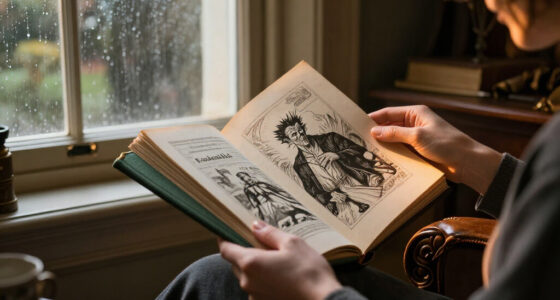
An illustrated edition of Frankenstein gives you a later artist’s vision of the novel, because Shelley’s original 1818 publication contained no illustrations. The images may deepen the story’s atmosphere, but they also influence what you imagine while reading. Treat each picture as an interpretation rather than an original part of Shelley’s book.
Artists make different choices. One may fill a scene with black shadows and wintry distance; another may focus on scientific instruments, bare rooms, and the creature’s isolation. A third may bring out his capacity for feeling through a turned head or a figure standing alone at the edge of a snowy landscape. Those choices can make the novel feel newly vivid, though they may also steer your sympathies.
Preview sample pages if you can. Look for the number of illustrations, where they appear, and whether they depict scenes directly or offer symbolic designs. A dramatic image at each chapter opening creates a different rhythm from a book with a full-page painting every few chapters. Picture reading a tense passage and meeting a vivid portrait of the creature before the prose has described him in your own mind; that image can linger.
The famous flat-headed, bolt-necked monster is part of the novel’s later cultural history, not a description supplied by Shelley in that exact visual form. If an edition uses a movie-like monster, you may enjoy the familiar horror shorthand. If you want room to form your own picture, seek art that leaves more to the text, or choose a copy with varied visual approaches.
Use the artwork’s style to set the mood you want
To choose an illustrated edition of Frankenstein that matches your taste, compare the art style and ask what kind of reading experience it creates. Engravings, painted scenes, contemporary illustrations, and graphic adaptations each place different emphasis on the same story. The right style depends on whether you want the book to feel historical, atmospheric, intimate, or visually immediate.
Engravings can give a page fine lines and dense shadows, like a set of old prints gathered beside the novel. Paintings may bring stronger color and a broader view of a landscape or laboratory. Contemporary illustration can feel spare and unsettling: a single red accent against a field of gray might make a scene’s isolation more striking than a busy, detailed image.
Graphic adaptations are their own format, so check whether the book adapts Shelley’s complete text or retells the story in comics form. A graphic novel can be an engaging route into the plot, but it isn’t automatically a full text edition. For instance, a reader who wants Shelley’s original language may prefer an illustrated novel with the prose intact, while someone who enjoys sequential art may welcome an adaptation’s pacing and panels.
Captions and artist notes can explain why an image emphasizes a particular scene or symbol. A short note about using landscapes to echo the characters’ isolation may help you see recurring visual choices on a second pass. But editions vary widely in what they show and how they explain it, so use a preview to decide whether the pictures invite your attention or crowd the reading experience.
Check for a complete novel and useful editorial notes
Before choosing an illustrated edition of Frankenstein, confirm that it contains the full novel and says which text version it prints. An adaptation or abridgment may suit some readers, but it won’t give you Shelley’s complete prose. A clear contents page and a sample of the text can help you tell the difference.
Next, decide how much context you want. Notes can clarify references and editorial choices; an introduction may explain the novel’s title, its publication history, or the differences between the 1818 and 1831 versions. A bibliography offers a trail for readers who want to explore further. If you’re reading for pleasure, a concise introduction and legible pages may be enough. If you’re preparing for a seminar, notes and a stated editorial basis may matter more than ornate paper.
Consider a practical example: you’re buying a gift for a reader who loved a recent screen adaptation and now wants Shelley’s novel. A handsome book with dramatic pictures might catch their eye, but if the description says “retold” or “adapted,” it may not meet their goal. Look for phrases such as “complete text,” check the named version, and review a sample spread if one is available.
For younger readers, inspect the specific book rather than assuming that illustrations make the story child-friendly. The full novel includes death, violence, grief, and unsettling imagery, while many illustrated editions target adults. Age suitability depends on the adaptation, the text, and the reader. A parent or teacher can preview sample pages and verify whether the book is abridged before choosing it.
Compare the book’s design with the way you’ll use it
An illustrated edition of Frankenstein should feel right in your hands as well as look good on a shelf. Paper, binding, type size, image reproduction, and dimensions affect whether a book works for repeated reading, quiet study, or display. A large art book may show every fine line beautifully, but it can be awkward to carry on a commute.
Think about the pages themselves. Cream paper can soften the contrast of black-and-white images; glossy stock may make color more vivid but reflect a reading lamp. Check whether the print is comfortably sized and whether illustrations have enough space around them. If you picture reading in bed, a heavy oversized volume can turn each page into a two-handed job. If you want to display it open, that same size may give a full-page image the presence you want.
Binding affects both appearance and use. A sturdy hardcover can suit a book you expect to revisit, while a flexible binding may be easier to hold for a long session. Examine how the pages sit near the spine: art that disappears into a tight gutter loses detail, especially when a picture crosses both pages. For a collector, clean reproduction and durable construction may count more than portability.
There’s a useful tradeoff here. A lavish production can make a strong gift or display piece, yet clear typography and comfortable dimensions often matter more for a first reading. Imagine choosing between a glossy oversized volume and a smaller book with readable type and thoughtful notes: your choice depends on whether you plan to admire it from a shelf or carry it from room to room.
Follow five checks before you buy or borrow
To choose an illustrated edition of Frankenstein, follow five checks in order: identify the text, confirm completeness, preview the art, assess the physical format, and verify the publication details. This quick sequence catches the most common mismatches before a compelling cover makes the decision for you.
- Identify the version. Look for 1818, 1831, both versions, or a clear editorial statement. Don’t assume that “classic text” answers the question.
- Confirm completeness. Check whether the book includes Shelley’s full novel or labels itself an abridgment, adaptation, or retelling.
- Preview the pictures. Note whether they appear throughout, only at chapter openings, or in a separate art section. Decide whether the style leaves room for your imagination.
- Check usability. Look at type size, dimensions, paper, binding, and how illustrations sit across the gutter. For a book club copy, readability may beat display size.
- Verify the edition details. Compare publisher, publication date, ISBN, and edition statement to distinguish a new edition from a reprint or a visually similar title.
This order helps when you’re browsing online, where a cover image can hide the contents and physical scale. For example, if you’re shopping for a friend who wants to read Shelley’s prose, the “complete novel” check should come before paper finish. If you’re adding a collectible to a shelf, confirm the binding and publication details as carefully as the illustrations.
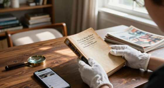
For signed, limited, or rare copies, request clear evidence of the claim and inspect condition details. A seller’s description should match the publisher’s information where possible. Current releases and availability change, so check publishers or booksellers for up-to-date publication details rather than relying on an old listing.
Match the edition to your reason for reading
The best illustrated edition of Frankenstein depends on what you want the book to do for you: support a close reading, deliver a strong visual experience, or become a collectible object. These goals overlap, but one usually leads. Naming it first makes it easier to decide which features deserve your attention.
If you’re reading Shelley for the first time, prioritize the complete text, comfortable typography, and artwork that interests you without dominating every scene. A slim introduction can help explain the novel’s historical setting. Think of this as choosing walking shoes: a striking look matters less if the book feels tiring to use after a few chapters.
For study, favor an edition that identifies its text, explains its editorial basis, and provides notes or a bibliography. The illustrations still count, especially if you’re exploring how artists have reimagined the creature, but they should sit alongside useful context. A book that includes both the 1818 and 1831 texts may help a reader compare Shelley’s revisions, if the layout remains easy to follow.
For a gift or display, design may take the lead. You might want rich color, substantial paper, and a binding that looks inviting on a shelf. The tradeoff is that a large, beautifully produced edition can be less comfortable for everyday reading. Recent editions continue to explore graphic formats, collector-focused designs, and volumes paired with commentary or archival material, so decide whether you value reading comfort, visual impact, or historical context most.
Choose the book for the hours you’ll spend with it. The most satisfying edition is the one whose text, pictures, and physical design all suit how you plan to read or keep the novel.
Frequently Asked Questions
Should I read the 1818 or 1831 version first?
Either version works for a first reading. The 1818 text is closer to Shelley’s original publication, while the 1831 edition reflects substantial later revisions and includes a new introduction. If you want to compare the novel’s development, look for an edition that includes both.
Are illustrations part of Mary Shelley’s original novel?
No. The 1818 novel was published without illustrations, so artwork in later editions is an artist’s interpretation. Preview it to see whether the images match the kind of reading experience you want.
How can I tell if an illustrated edition contains the complete novel?
Check the book description and contents for a statement that it contains the complete text, and look for a label such as “abridged,” “adapted,” or “retold.” Confirm whether it prints the 1818 or 1831 version, and use a page preview if the details are unclear.
Is an illustrated edition suitable for children?
Suitability depends on the specific edition and reader. Shelley’s full novel includes death, violence, grief, and unsettling imagery, and many illustrated editions are made for adults. Preview the art and text, and check whether the book is an adaptation or an abridgment.
Is Frankenstein the creature’s name?
No. Victor Frankenstein is the scientist, and Shelley does not give the creature a personal name. The creature is often called “Frankenstein” in later popular culture, but that isn’t the naming used in the novel.
Should I choose an illustrated edition or a scholarly edition?
Choose according to your goal. For visual impact, focus on the artwork and production; for study, look for a clearly identified text, notes, and editorial context. Some editions combine illustrations with commentary, so check the contents before deciding.
Conclusion
Choose your edition in this order: text, completeness, artwork, then physical design. That simple sequence helps you find a book that does more than look suitably Gothic; it gives you the version of Shelley’s novel and the reading experience you actually want.
Then open it, meet the creature on the page, and let the pictures add their shadows without mistaking them for Shelley’s own.
Halloween Picks

HOPOCO Halloween Pumpkin Fog Machine with 12 LED Colors and 4 Light Modes

Haunted Hill Farm 2-Ft. Zombie Raccoon Halloween Animatronic

10 ft Halloween Inflatable Archway with Built-in LEDs
As an affiliate, we earn on qualifying purchases.