TL;DR
The best illustrated editions of Frankenstein make their text, artwork, and contents clear: check whether they print the 1818 novel, Shelley’s revised 1831 version, or both, and confirm that the book contains the complete prose rather than an adaptation. For a first read, prioritize legible pages and a clearly identified text; for a collection, verify the illustrator, printing, binding, condition, and any signature or limitation before you buy.
Check whether an edition prints the 1818 text, Shelley’s revised 1831 text, or both; don’t infer the version from the cover or publication date.
Confirm that the book contains the complete novel if you want Shelley’s prose rather than an adaptation or abridgment.
Use sample pages to judge type size, image placement, color reproduction, and how the binding opens.
For collecting, verify the illustrator, publisher, printing, binding, condition, signature, limitation, and provenance.
Choose artwork for the interpretation you want to revisit; illustrations shape your image of the Creature and the novel’s settings.
A reader’s & collector’s field guide · Mary Shelley
Best Illustrated Editions of Frankenstein for Readers and Collectors
The right illustrated copy brings Shelley’s novel and its visual world together. Start with the text it prints, then weigh the artwork, readability, and edition details against the way you plan to read or collect it.
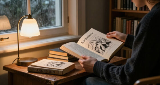
Which Frankenstein are you opening: the 1818 novel, Shelley’s revised 1831 text, or both?
Check the contents page before the cover artOriginally published anonymously.
Includes Shelley’s new introduction and substantial revisions.
Text, artwork, and physical format.
Shelley’s Creature has no name in the novel.
01 / Choose the text
Check the text before you fall for the artwork
The two versions are not interchangeable. Don’t infer the text from a modern publication date or dramatic cover: look for an explicit statement in the publisher’s description or title pages, and note the editor if named.
1818 text
Choose this to read the novel in its original published arrangement and discuss its publication history.
1831 text
A substantially revised version with Shelley’s introduction. Many modern editions follow this text.
Dual-text edition
A useful choice for comparing changes directly; expect a longer, possibly heavier book.
Completeness check: Confirm the book contains Shelley’s complete prose novel, not an abridgment, graphic adaptation, or retelling. Supplementary material such as the 1831 introduction and editorial notes is a separate choice.
02 / Compare approaches
Find the edition that fits your shelf—and your reading
There is no single best format for everyone. Compare editions by what they offer, then inspect the stated contents and sample pages before deciding.
Illustrated classics
Often affordable and approachable for a first read. Check type, artwork quality, and notes.
Gift & deluxe
May offer larger pages, color images, decorative binding, or extras. Deluxe alone does not mean rare.
Artist-led
A distinctive interpretation can shape how you picture the Creature and the settings.
Scholarly editions
Publication history, variants, and notes may take priority over abundant artwork.
Graphic retellings
Can be visually compelling, but they adapt the story rather than print the complete novel.
03 / Read the artwork
Choose art that adds atmosphere without taking over
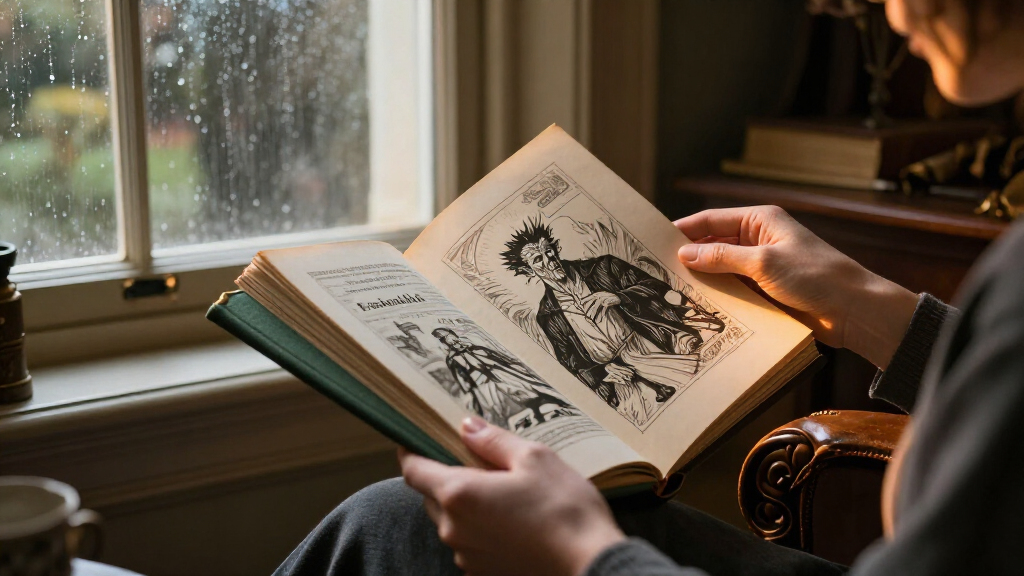
Illustrations can deepen a scene and steer your imagination. Check whether the visual approach suits your taste and leaves the prose comfortable to read.
| Art approach | What it can add | What to inspect |
|---|---|---|
| Atmospheric line art | Texture and mood without crowding the prose | ✓ Image frequency and placement |
| Color paintings | Strong settings and dramatic contrast | ~ Paper and reproduction, especially in dark scenes |
| Artist-led interpretation | A distinctive visual world from start to finish | ✓ Whether this Creature is one you want to revisit |
| Scholarly illustrations | Visual context alongside editorial material | ~ Space given to notes versus artwork |
Sample spread test: Check type size, image placement, color reproduction, and whether the binding opens comfortably. A dark full-page image or pale drawing may look different on the page than in a product listing.
04 / Match your habits
Prioritize the experience you’ll actually use
For a first read, a complete, legible edition with a clearly identified text usually matters more than elaborate binding. Reading on a train and lingering over large plates call for different formats.
Text → Pages → Extras → Format
Confirm the full novel and its version. Scan a sample spread for readable type and artwork near the relevant scene. Decide whether you want the introduction or notes. Then consider weight, paper, binding, and where you’ll read.
Confirm completeness
Look for the complete novel, not an adaptation or abridgment.
Identify the text
Check for 1818, 1831, or both in the stated contents.
Scan a spread
Judge type size, image placement, and reproduction quality.
Choose the format
Balance portability, page weight, binding, and display appeal.
05 / Collect with evidence
Verify the edition details that make a copy distinct
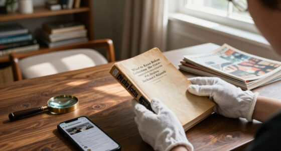
A collectible copy earns attention through verifiable details, not just a dramatic cover or “deluxe” label. Age alone does not establish rarity or value; scarcity, demand, condition, edition details, and provenance all matter.
Record the edition
- 01Illustrator and publisher
- 02Publication date and printing
- 03Binding and physical condition
- 04Stated text, contents, and completeness
Verify the claim
- 01Check signature claims and provenance where available
- 02For a numbered limitation, match the copy to its documentation
- 03Compare condition and edition details across similar copies
- 04Confirm current publisher details and availability before recommending
Decision path
From first glance to the right copy
Let the book’s text and physical evidence guide the choice; let the artwork make the final connection.
Check the text before you fall for the artwork
The best illustrated editions of Frankenstein identify whether they print the 1818 text, Shelley’s revised 1831 text, or both, because those versions are not interchangeable. The 1818 book preserves the novel’s first published form; the 1831 version reflects Shelley’s later revisions and includes a new introduction [1]. If you want to compare how the novel changed, a dual-text edition can be especially rewarding. The title page or publisher’s description should state the version and, ideally, name the editor. Don’t assume that a handsome illustrated hardback reproduces the earliest text: many modern editions use 1831. A reader who wants Shelley’s first published arrangement should look for an explicit reference to the 1818 edition, rather than relying on a publication date printed on the new book. For example, imagine you’re buying a copy for a book club focused on the novel’s publication history. A clearly labelled 1818 text lets the group discuss the original form; an edition that includes both versions gives you a direct comparison, though it may add pages and weight. If you’re reading for atmosphere, the 1831 introduction may offer useful context, but it doesn’t replace checking which novel follows it. These details matter because artwork can make two books look like alternate covers for the same experience, while their editorial choices differ. Treat the text statement as your first filter, then decide whether the images and format suit you.Popular right now

De'Longhi Rivelia Automatic Espresso Machine with Milk Frother

TCL QM64L 85-Inch QD-Mini LED 4K Smart Fire TV

Dyson Ball Animal 3 Corded Upright Vacuum
As an affiliate, we earn on qualifying purchases.
Choose art that adds atmosphere without taking over
Illustrations shape the world you imagine, so the best illustrated editions of Frankenstein match an art style to your reading preferences. Fine line drawings can leave room for your own vision; full-color paintings may give the Alps, laboratories, and Arctic frame a more cinematic presence. Neither approach is neutral, and neither is automatically better.| Art approach | What it can add | What to check |
|---|---|---|
| Atmospheric line art | Texture and mood without crowding the prose | Whether the images are frequent enough for your taste |
| Color paintings | A strong sense of setting and dramatic contrast | Paper and reproduction quality, especially in darker scenes |
| Artist-led interpretation | A distinctive visual world throughout the book | Whether the artist’s version of the Creature appeals to you |
| Scholarly illustrations | Visual context alongside editorial material | How much space the notes take relative to the artwork |
Match the edition to your reading habits
For a first read, choose a complete edition with legible type, comfortable page layout, and a text version you can identify. That combination usually matters more than an elaborate binding: a book that tires your eyes or keeps its illustrations far from the story can turn a gripping night of reading into a chore. A practical check takes only a few minutes:- Confirm completeness. Look for a statement that the book presents the full novel, not an abridgment or adaptation.
- Identify the text. Check whether it follows 1818, 1831, or includes both.
- Scan a sample spread. See whether the type is comfortable and whether images sit near the scenes they illustrate.
- Check supplementary material. Decide whether you want Shelley’s 1831 introduction, editorial notes, or publication context.
- Consider the format. A lighter paperback may travel easily; a substantial hardback may feel at home on a display shelf.