
TL;DR
The best Gothic art prints for a reading room connect to books, medieval art, Gothic architecture, or dark romantic imagery while fitting the room’s light, wall space, and reading mood. Choose one visual direction, check the exact print and frame dimensions, and protect the piece from direct sunlight and dampness.
Choose a clear mood—scholarly, romantic, or dramatic—before choosing an image.
Connect the print to books through manuscripts, libraries, architecture, ruins, or literary motifs.
Check color and contrast in the room’s actual light; mats and frames can change how dark a print feels.
Mock up the finished dimensions on the wall and judge the art from your seated reading position.
Read material, edition, licensing, and return details; keep delicate prints away from sun and dampness.
A Reading Room Field Guide · Art & Atmosphere
Best Gothic Art Prints for a Reading Room
Choose artwork that connects with books, medieval forms, Gothic architecture, or dark romantic imagery. The right scale, palette, frame, and placement let the room feel scholarly, romantic, or dramatic—without making it gloomy.
“Gothic” has more than one meaning
Choose the tradition first. A manuscript and a haunted manor can both be Gothic, but they set very different scenes.
Illuminated & architectural
Stained glass, decorated manuscript letters, church sculpture, pointed arches, and intricate tracery bring history and detail to a scholarly nook.
Historical romance
Later designs that revisit medieval forms use rich ornament, dramatic architecture, and romantic or historical subjects.
Shadow & symbolism
Ruins, ravens, moonlit woods, dark forests, and modern symbolic art create a more theatrical or mysterious atmosphere.
Name the feeling you want before shopping: scholarly and calm, romantic and misty, or dramatic and mysterious. Consider how you want to feel after an hour in the chair, not just how striking the image looks at first glance.
Let the art support the reading
Manuscript details and architectural studies can encourage a focused, contemplative mood. Ivy-covered stone or a moonlit landscape leaves more room for imagination. A highly dramatic scene may become the room’s main event; a quieter print can recede behind the page.
Match the image to the room’s purpose. For history and research, look to maps, manuscript pages, or antique library interiors. For poetry and fiction, try mist, ruins, or roses. One recurring visual direction can connect shelves, chair, and artwork.
Would you want this image beside you for a whole chapter?
Choose something worth looking at twice
The strongest choices connect to books, stories, or the pleasure of close attention.
Manuscripts, maps & arches
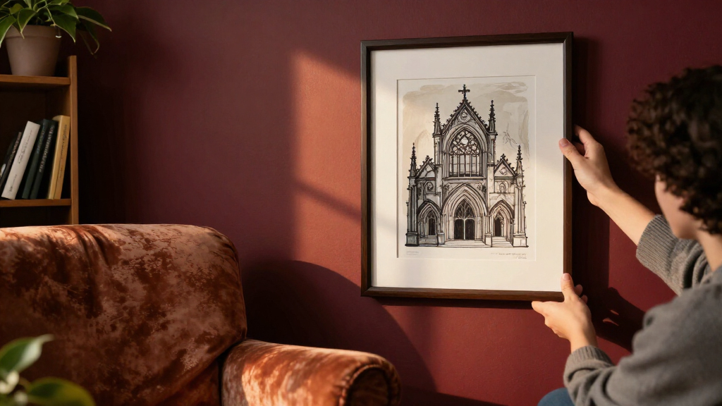
An illuminated initial adds jewel-toned detail above a desk; a cathedral arch or stained-glass window can make a narrow wall feel taller.
Ruins, roses & landscapes
Misty landscapes, ivy-covered stone, and roses offer atmosphere with softer edges. They can feel suggestive without dominating the room.
Ravens & shadowed interiors
A raven’s silhouette reads clearly from across the room. Detailed engravings reward a closer look near the reading chair.
For a gallery wall, repeat a motif, palette, period, or printmaking style. A manuscript detail, cathedral arch, and botanical engraving can feel collected when they share muted green and aged cream. If you prefer variety, keep one element—such as frame color or paper tone—consistent.
Color, mat, and light change the story
Dark imagery can feel intimate or imposing. The surrounding wall and evening light help decide which.
Charcoal, burgundy, forest green, midnight blue, and antique gold suit Gothic art, but an all-black palette is not required. Muted cream, faded red, or jewel tones can soften the atmosphere. A pale mat can lift a charcoal engraving from a dark wall; a black frame can make the same print crisp against cream.
Size it from your reading chair
A print should suit the wall and the furniture around it—not only the product photo.
Measure
Check the exact print dimensions and the finished size with its frame.
Mock up
Mark the full dimensions on the wall and judge the scale beside the furniture.
Sit down
View the artwork from your usual reading position; check visibility and glare.
Protect
Keep delicate or valuable works away from direct sunlight and dampness.
Read the details behind the image
Labels such as “archival,” “giclée,” or “museum quality” do not guarantee identical materials or longevity across sellers.
Paper & printing: Look for clear information about paper, inks, and print dimensions.
Framing: Confirm whether the listing includes a frame. Dark wood, black, aged metal, or a simple frame can suit the style.
Edition & source: Check whether the work is a reproduction, contemporary design, open edition, or limited edition, and review image rights.
Care & returns: Read return details. For older or valuable works, choose protective framing materials and limit exposure to light.
A good print belongs to the whole room
Use this chain to carry the idea from first impression to lasting atmosphere.
Choose the Gothic mood you want to read in
Gothic art prints suit a reading room when their mood supports the kind of reading you do there. Medieval and scholarly imagery feels different from romantic ruins or contemporary macabre art, even when all three use shadows and old stone. Pick the feeling first, then look for images that express it.
Gothic can mean several things: medieval art such as stained glass and illuminated manuscripts; Gothic Revival designs that revisit medieval forms; literary imagery of ruins, ravens, and moonlit woods; or contemporary art that uses shadow and symbolism. A reproduction of a medieval letter may bring a desk a studious, jewel-colored accent. A haunted manor in a black frame creates a more theatrical note.
These distinctions matter because a subject does more than decorate the wall: it shapes what the room seems to invite you to do. Manuscript details and architectural studies can support a focused, contemplative mood, while a moonlit landscape leaves more space for imagination. The tradeoff is that highly dramatic imagery may become the room’s main event, which can distract if you want a quiet backdrop for reading. Consider how you want to feel after an hour in the chair, not only how striking the image looks at first glance.
Try treating the room like a book’s opening chapter. If you want a place for history and research, look for architectural details, manuscript pages, or antique library interiors. For poetry or fiction, a misty landscape or an image of ivy-covered stone may feel more suggestive. One clear direction can tie your shelves, chair, and art together like a recurring motif in a novel.
Before shopping, name the mood in a few words: scholarly and calm, romantic and misty, or dramatic and mysterious. Then use those words to screen out prints that are dark for darkness’s sake but do not feel right in your room.
Popular right now

Ninja Foodi 10-Qt DualZone Air Fryer, 6-in-1, Black (DZ302)

Shark AI Ultra Robot Vacuum, Black/Silver, AV2511AE

KitchenAid Classic Series 4.5-Quart Tilt-Head Stand Mixer, Onyx Black
As an affiliate, we earn on qualifying purchases.
Pick subjects that make your reading room feel personal
The best gothic art for a reading room often has a connection to books, stories, or the act of looking closely. Manuscript details, cathedral interiors, old libraries, ruins, and literary portraits give you something to return to between chapters. Choose imagery that invites attention without competing with the page in your hands.
For example, an illuminated initial—a large, decorated letter from a manuscript—can bring a small patch of red, blue, and antique gold above a writing desk. A print of a pointed arch or stained-glass window can make a narrow wall feel taller. A bookish still life, with worn volumes and a candleholder, ties the artwork directly to the room’s purpose.
Other strong options include ravens, roses, moths, and ivy, as well as engravings of castles or historic interiors. A single raven print could suit a collector who wants a sharp silhouette; a botanical image of climbing ivy may feel softer beside a warm reading lamp. These subjects work differently in a room: a bold silhouette reads quickly from across the space, while fine botanical lines reward a closer look. That can guide placement—choose a high-contrast raven where you see it on entering, and a detailed engraving near the chair. You can combine subjects, but give them a shared thread.
A small gallery wall works best when you repeat a motif, palette, period, or printmaking style. Imagine three pieces above a bookcase: a manuscript detail, a cathedral arch, and a botanical engraving, all in muted green and aged cream. The shared colors make the group feel collected over time rather than assembled from unrelated dark images. Repetition gives the eye a path through several works; too many unrelated subjects can make the wall feel busy and pull attention away from reading. If you prefer variety, keep one element—such as frame color or paper tone—consistent so the pieces still feel connected.
- For a scholarly nook: manuscripts, maps, and architectural studies.
- For a romantic corner: ruins, moonlit landscapes, and roses.
- For a dramatic accent: ravens, shadowed interiors, and contemporary symbolic art.
That is one useful answer to what makes a print feel at home among books: its subject gives your eye a story to follow, while its style belongs with the rest of the room.
Use color and contrast to keep the room inviting
Color and contrast decide whether a Gothic print feels intimate or imposing. Charcoal, burgundy, forest green, midnight blue, and antique gold all suit the style, but a room does not need an all-black palette. Muted cream, faded red, or a jewel-toned detail can soften a print without draining its atmosphere.
Start with the wall where you plan to hang the piece. A dark engraving on a dark wall can blend into a quiet, immersive backdrop; add a pale mat if you want the image to stand out. On a cream wall, a black frame may make the same print feel crisp and graphic. It is a little like adjusting the margins around a poem: the image stays the same, but its presence changes.
Check the print in the room’s real light. A charcoal forest may look rich at noon but lose its fine branches in a dim corner at night. Glossy paper can throw a lamp’s reflection straight back at you, especially above a chair positioned near a window. When possible, compare a sample or a seller’s detail images with the wall and lighting you actually have.
Light affects both legibility and mood. If the darkest areas merge together under your evening lamp, a print with more midtones or a lighter mat can preserve detail without changing the room’s palette. If you choose a very high-contrast image, it will draw the eye quickly; that can anchor a nook, but it may compete with the books and furnishings. A softer image is easier to live with as a background, though it may need a contrasting frame to read clearly from across the room.
To keep a cozy balance, pair one strong dark image with warm light and tactile materials. Picture a deep-blue cathedral print above a walnut side table, with a soft amber lamp and a rust-colored throw nearby. The artwork provides shadow; the lamp and fabric keep the corner welcoming. Atmosphere comes from contrast, not from making every surface dark.
Let the print carry the mystery; let the room carry the warmth.
That balance matters most in a small reading room, where high-contrast art can feel larger than its frame. A smaller piece with a pale border may add more character than a huge, nearly black image.
Match print size and placement to the chair and wall
Print size should relate to the furniture and wall around it, not just to the artwork’s subject. One larger print can anchor a reading nook, while a compact group can fill the space above a desk or bookcase. The right scale helps your art feel placed rather than squeezed in.
Use a simple paper mock-up before ordering. Cut newspaper or scrap paper to the listed frame size and tape it where the art will hang. Sit in your reading chair and look at it from your usual position. If the mock-up looms above a narrow chair, try a smaller size; if it disappears over a long bookcase, test a wider layout or a pair of prints.
Scale also changes how the image is read. A small print encourages close looking and can preserve open wall space, but fine lettering or delicate tracery may be hard to see from the chair. A larger image makes those details more legible and gives the nook a stronger focal point, though it can dominate a compact room. Decide which matters more for that wall: the art as a quiet discovery or as a defining feature.
For a gallery wall, repeat one feature so the collection feels connected. Three frames in dark wood, or four images with the same faded-red accent, can create a visual rhythm. Leave enough wall space between frames for each image to be read on its own, especially if one piece contains fine manuscript lettering or detailed architectural tracery.
Seated viewing matters in a room designed for reading. Hang the work where you can see it without craning your neck from your chair, and keep the bottom edge clear of furniture that could hide the image. Above a desk, check that the frame does not compete with a task lamp or cast glare onto your work.
Keep delicate or valuable prints out of direct sunlight, which can fade inks and paper over time. Avoid damp areas, too: an otherwise perfect print above a radiator or beside a humid window may not stay in good shape. Placement is part of the art choice, much like choosing the right shelf for a well-loved edition.
Check paper, printing, framing, and image rights before you buy
A useful print listing explains its materials, dimensions, and image source. Words such as “archival,” “giclée,” and “museum quality” appear in product descriptions, but those labels alone do not tell you exactly what paper or inks a seller uses. Look for concrete details so you know what will arrive and how it may look framed.
Confirm whether the listed dimensions describe the paper, the printed image, or the finished frame. A 12-by-16-inch sheet with a large white border has a smaller image area than a full-bleed print of the same size. If you are fitting art into a narrow space between shelves, that distinction can determine whether the print looks balanced or crowded.
Also check whether a frame is included, what paper and printing method are specified, and whether the image is a reproduction, an open edition, or a limited edition. Many online prints reproduce works held by museums or archives. Check the institution’s reuse terms and the seller’s licensing information instead of assuming every image online is free to reproduce.
These checks help set expectations as much as they help judge quality. A detailed listing lets you compare options and choose materials suited to your budget and display. If the paper or printing process is unspecified, you may not know how the image will handle fine lines, dark tones, or framing; that uncertainty matters most for intricate engravings and images you plan to keep for years. Edition labels also describe how a work is offered, but do not by themselves tell you whether its reproduction is faithful or well made.
A frame changes both appearance and protection. Dark wood, black, or aged-metal finishes can suit Gothic interiors, while an ornate frame may overwhelm a print that already has intricate details. For older or valuable works, suitable framing materials can help protect the paper from contact with acidic materials; avoid treating a decorative frame as a guarantee of conservation quality.
Before ordering, use this short checklist:
- Subject: Does the image fit your room’s mood and bookish character?
- Dimensions: Are you measuring the image, paper, or framed piece?
- Materials: Does the listing name the paper and printing method?
- Rights: Is the image’s source or licensing information clear?
- Delivery and returns: Can you check packaging, production times, and return terms?
- Placement: Can you keep it away from direct sun and dampness?
A quick review of these points can save you from receiving a print that is lovely online but too glossy, too small, or difficult to frame.
Compare one large print with a small gallery wall
Choose one large Gothic print when you want a clear focal point; choose a gallery wall when you want several related details to build a story. Neither arrangement works in every room. Your available wall space, the artwork’s detail, and the number of subjects you enjoy will guide the choice.
A single print may suit a reading chair tucked into a corner. One wide engraving of a cathedral interior can give the nook a strong identity without making it feel busy. This works especially well when the room already contains patterned books, rugs, or upholstery, because the wall keeps some visual breathing room.
A gallery wall can suit a longer stretch above a desk or bookcase. For instance, combine a small stained-glass study, an ivy engraving, and a moonlit ruin, then repeat a dark frame or muted green accent across all three. That shared visual thread helps the group feel curated, like a shelf of related books rather than a row of unrelated covers.
The choice is a tradeoff between focus and variety. One print gives the eye a clear place to land and is simpler to arrange, but it needs enough visual weight to hold the wall by itself. A gallery wall can make a larger space feel personal and let you include several subjects, though the combined frames and details may make a small nook feel crowded. Repeated colors or frames help control that busyness, while generous gaps keep each image readable.
| Display | Works well when | Watch for |
|---|---|---|
| One larger print | You want a strong focal point above a chair or narrow console. | Check its width against the furniture so it does not overwhelm the wall. |
| Small gallery wall | You have several related images and a wider wall to fill. | Repeat a palette, frame, or subject, and leave breathing room between pieces. |
Try both layouts with paper templates before committing. A single print can feel too lonely above a long bookcase, while a gallery may crowd a compact corner. Your wall is part of the room’s composition; the best arrangement gives the eye a place to rest before it returns to the page.
Build a collection that can grow with your reading life
A Gothic print collection feels more personal when it grows from a clear thread. That thread might be a color, a period, an architectural motif, or a subject you keep meeting in your books. You do not need to buy a matching set all at once; leave room for pieces you discover later.
Try a slow, shelf-by-shelf approach. Begin with one print above the reading chair, perhaps a hand-colored botanical plate with ivy or a rose. When you find a second image that shares its faded green and cream palette, place it nearby. The relationship can be subtle, like two characters who belong to the same story without wearing identical costumes.
Online access to museum, library, and archive collections makes historically grounded images easier to discover, though image quality and reuse rights vary. A digital scan may reveal beautiful fine detail, but the finished print depends on the resolution, paper, and printing choices. Check the listing and the collection’s terms, especially if the artwork’s attribution matters to you.
Mixing historical and contemporary work can also make a room feel lived-in. An antique-looking cathedral engraving beside a modern photograph of a shadowed staircase can create an engaging contrast, provided you connect them with a shared frame or palette. History and new work can sit together when you give the eye a bridge between them.
Keep a note of the artist or collection, dimensions, and materials for each piece. That small record helps when you rearrange the room, replace a frame, or want to add a related image. Over time, your wall becomes a reading list in its own right: a record of the stories, places, and visual details that have stayed with you.
Frequently Asked Questions
What art counts as Gothic?
Gothic art can refer to medieval religious imagery and architecture, later Gothic Revival design, Gothic literary scenes, or contemporary dark art. A stained-glass detail and a moonlit ruin both fit the label, but they create different moods. Choose the meaning that suits your room.
What Gothic prints work best in a reading room?
Prints linked to books, manuscripts, architecture, and literature feel at home among shelves. A cathedral engraving can add height above a chair, while an illuminated letter can bring color to a desk. The best fit depends on your wall, lighting, and preferred mood.
How can I make Gothic decor feel cozy rather than gloomy?
Pair a dramatic print with warm lighting, comfortable textiles, and natural materials such as wood. Choose an image with lighter details or use a pale mat to lift a dark composition. One atmospheric print can create more balance than covering every wall in dark imagery.
Should I choose one large print or a gallery wall?
A single larger print creates a clear focal point, while a small gallery wall lets you combine related images. Try paper templates on the wall and view them from your chair before deciding. A shared palette or frame style helps a group feel cohesive.
What frame suits Gothic art?
Dark wood, black, and aged-metal finishes often suit Gothic interiors. An ornate frame can complement a simple image, but it may overwhelm a highly detailed print. Match the frame to both the artwork and the room, and consider suitable protective materials for older or valuable work.
How can I tell whether a Gothic print is good quality?
Look for specific information about paper, inks, printing method, dimensions, and image source. Terms such as “archival” or “museum quality” do not give you the same detail. Also check whether the listing describes a reproduction or an edition, and whether a frame is included.
Can I use a museum image as a wall print?
Reuse rights depend on the image and the institution. Check the museum or archive’s stated terms and the seller’s licensing details instead of assuming that an image available online is free to reproduce. Clear source information makes it easier to understand what you are buying.