
TL;DR
For most horror figure displays, start with a dimmable neutral white light aimed slightly from above and off to one side. It reveals paint and sculpted texture while preserving shadows; a restrained backlight or colored accent can add atmosphere without hiding the figure’s details.
One small change can make the monster in your cabinet look like a carefully sculpted collectible—or a flat shape lost behind glass. Light direction, color, and brightness decide which details catch your eye and which disappear into shadow.
This guide will help you choose the best lighting for horror figure displays, from a simple single-figure setup to a layered cabinet scene. You’ll see how to reveal paintwork, control glare, and create atmosphere without letting colored light swallow the sculpt. The aim is a display that feels eerie from across the room and rewarding up close.
Start with a dimmable neutral white light, angled slightly from above and off-center.
Use below lighting for a deliberately unsettling effect, knowing it can hide facial detail.
Keep saturated accents behind or below the figure so they don’t distort paint colors.
Check glare from your usual viewing position and adjust the light before increasing brightness.
Read fixture guidance, keep case ventilation open, and note whether direct sunlight reaches the display.
Collector’s Field Guide · Display Lighting
Best Lighting for Horror Figure Displays
A dimmable neutral key light, aimed slightly from above and off-center, reveals paint and sculpted texture while preserving shadow. Add restrained color behind the figure for atmosphere without losing the details that make it yours.
At a glance
Five rules for a better display
Start simple and change one thing at a time. A few careful adjustments can turn a flat shelf into a small, readable scene.
Begin with dimmable neutral white, slightly above and off-center.
Use light from below for an unnatural effect, knowing facial detail may disappear.
Keep saturated accents behind or below the figure to protect paint detail.
Check reflections from where you usually view the cabinet before raising brightness.
Follow fixture guidance, keep ventilation open, and consider sunlight exposure.
01 · Shape the shadows
Choose the direction that reveals the sculpt
Move the same lamp around the figure. The changing shadow pattern can reveal texture—or hide the face.
Readable drama
Aim slightly down toward the face or torso. Cheekbones, stitches, fur, and mask ridges gain shape while the face stays legible.
Texture and contrast
A side beam picks out details and deepens shadow. Soften it or add low-level fill if defining features vanish.
Unnatural effect
Light from the base sends shadows upward for an eerie vignette. It can obscure the brow, eyes, and chin.
02 · Balance the palette
Keep the figure true; color the scene
Use a neutral source to judge paint first. Then introduce a single accent and see whether it supports the subject.
Neutral white
A dependable starting point for reading actual paint, facial features, and sculpted seams.
Warm white
Can suggest an aged room or candlelit scene. Check that pale paint does not look too yellow.
Cool white
Can evoke moonlight or a clinical setting. Let the figure’s finish guide the choice.
Saturated color
Red, green, or blue creates genre mood, but can distort paint and swallow fine detail.
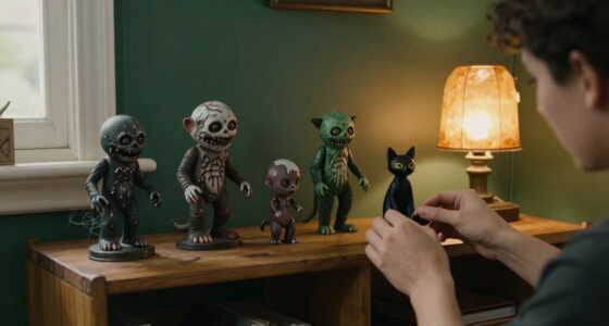
A dim blue strip behind the figure can suggest night while a neutral spotlight keeps the eyes, paint chips, and sculpted seams visible.
LIGHT THE SUBJECT FIRST · ADD ONE ACCENT · STEP BACK AND CHECK03 · Tune the scene
Set brightness for detail, then test the room
There is no single brightness for every shelf. The target is a clear face and silhouette without washed-out paint or distracting reflections.
04 · A four-step setup
Build the scene in small adjustments
Start with the figure as the main subject. Add fill or an accent only when you can name what it improves.
Set the figure
Choose its shelf position and leave room for light to reach the head and shoulders.
Add one key light
Use neutral white, slightly above and off-center, aimed at the face or torso.
Check detail and glare
View from your normal standing position. Shift the angle or dim harsh highlights.
Add one effect
Try a soft fill, dim backlight, or restrained color accent—then check the figure again.
05 · Practical choices
Match the fixture to the display
Compact LEDs, strips, rechargeable accents, and smart lights offer flexibility. Check current specifications and the space before choosing.
Adjustable spotlight
A simple key light aimed slightly off-center is an easy, low-clutter starting setup.
Dim backlight
Place behind the figure to separate its silhouette from the backdrop.
Diffused lighting
Try lights along the top or sides. Inspect reflections on glass, glossy paint, and eyes.
Layered sources
Combine key, soft fill, and low background light. Adjust each source one at a time.
LED fixtures are commonly chosen for lower power use and less heat than many older lighting types. Check temperature, product instructions, ventilation, wiring, and sunlight exposure—especially inside an enclosed case.
CHECK BRIGHTNESS · COLOR TEMPERATURE · DIMMING · POWER · HEATStart with a neutral light that shows the figure clearly
The best lighting for horror figure displays begins with a neutral white key light aimed at the figure from slightly above and off to one side. This angle reveals sculpted texture and paint while leaving some shadows in place. It gives you a dependable view before you add color or theatrical effects.
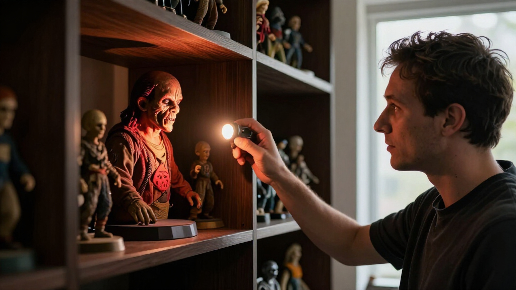
Think of the key light as the main actor on a small stage. If it strikes a figure straight on, the face can look flat, much like a portrait taken with a phone flash. Move the light to one side and a cheekbone, torn coat edge, or ridged mask starts to cast a shadow. For instance, a small adjustable spotlight above the left shoulder may reveal the folds in a dark cape that vanish under a ceiling lamp.
“Neutral” doesn’t need to mean cold or sterile. It means choosing a white source that lets you judge the figure’s actual colors before you style the scene. A warm room lamp can make pale paint look yellow; a saturated blue accent can turn a gray sculpt almost navy. Begin with a white light, then decide whether the mood needs a warmer or cooler note.
Lighting shapes how a horror figure reads: a high, soft beam can feel like moonlight, while a sharper side beam can make texture seem more pronounced. The useful test is simple: can you see the face and one or two signature details from where you normally stand? If not, adjust the light before adding another fixture.
Popular right now

Shark Rocket Ultra-Light Corded Stick Vacuum, HV301, Gray/Orange

De'Longhi Magnifica Evo Fully Automatic Espresso Machine with Manual Milk Frother, Silver

Samsung 85-Inch QN70H Neo QLED 4K Smart TV (2026)
As an affiliate, we earn on qualifying purchases.
Choose the direction that reveals the sculpt
Light from above or from the side to reveal texture; use light from below for a deliberate, unnatural effect. Where you place a lamp changes the shadows on a figure’s face and body, even when the bulb itself stays the same. The direction is part of the storytelling.
A light positioned slightly above eye level often gives you a readable face and natural-looking shadows. A side light adds drama: it can pick out stitches, fur, cracked stone, or a glossy eye. By comparison, a light placed low on the base sends shadows upward and can make a familiar face seem strange. That effect can be fun in a Halloween vignette, but it may hide details under the brow and chin.
Try the same small lamp in three positions before you commit. With a masked figure on a shelf, move it from just above the head, to one side, then to below the base. Notice how each setup changes the mask’s eye sockets and the outline of its coat. The sculpture hasn’t changed; the shadow pattern has.
For a practical starting arrangement, point one adjustable spotlight slightly down toward the face or torso, rather than directly into the front of the figure. If you want more mystery, keep the shadows but add a soft fill light at low intensity. It works like opening a curtain a few inches: the scene stays moody, but you can still read what’s there.
Use color for mood without losing paint detail
Keep a neutral light on the figure and reserve saturated color for the background or an accent. Red, green, and blue can create a clear genre mood, but they also change how the figure’s paint appears. A bold color wash may make fine sculpting and subtle paintwork harder to see.
Warm white can suggest an aged room or candlelit scene; cool white can feel like moonlight or a clinical display. Those are visual impressions, not fixed rules, so let the piece guide you. A weathered brown coat might look rich under warm light, while a pale creature against a dark backdrop may stand out under a cooler white beam.
For instance, place a dim blue strip behind a figure while keeping a small neutral spotlight on its face. The background takes on a night-sky cast, but the eyes, paint chips, and sculpted seams remain legible. If you instead bathe the entire figure in blue, gray paint may look blue and warm highlights may disappear. That can work for a stylized scene, but it’s less useful when you want to show the collectible itself.
Use color like seasoning. Add one accent, step back, and see whether it supports the figure or competes with it. A green glow behind a swamp creature may fit the setting; the same glow spilling across a carefully painted face can muddy the details you wanted to display.
Set brightness so shadows add atmosphere, not confusion
Set brightness high enough to read the face and defining details, then dim the light until the shadows feel intentional. There is no one brightness that suits every figure or room. A dark shelf in a quiet corner needs less output than a display across a sunlit room.
Too much brightness washes out painted gradients and makes a display case reflect like a mirror. Too little can turn a detailed figure into a silhouette. Dimming helps you find the middle. If a fixture has no dimmer, changing its distance or aiming it at a wall or backdrop can soften the effect.
Picture a collector setting a figure on a narrow bookshelf beside a window. At noon, daylight may already brighten the cabinet; a strong spotlight can erase the shadows on the sculpt. At night, that same lamp might be just right. Check the display both in daylight and after dark, since the room changes the result.
Contrast helps the figure stand out against a darker background, but extreme contrast hides information. A black figure against a black backdrop may look dramatic until its shoulder and base disappear. Try a low-level background light or a slightly lighter panel behind it. The goal is a clear silhouette with enough illumination to enjoy the work up close.
Build a simple setup in four adjustments
You can create a convincing display with one key light, a dark backdrop, and a few minutes of testing. Start with the figure as the main subject; add fill or accent lighting only when you can name what it improves. This keeps the setup manageable and makes it easier to spot glare or distracting shadows.
- Place the figure first. Set it where you want it to live, with enough room around the head and shoulders for the beam to reach.
- Aim one neutral spotlight. Put it slightly above and off-center, pointing toward the face or torso rather than straight at the display glass.
- Adjust brightness and angle. Check whether the eyes and a signature texture are visible. Shift the light or dim it if highlights look harsh.
- Add one supporting effect. Try a dim backlight behind the figure or a low-level colored accent, then remove it if it steals attention.
For example, a single figure on a mantel might need only a compact adjustable light aimed at the upper body. In a cabinet, the same figure could benefit from a soft light along the top and a dim glow behind it. The room, case, and viewing angle matter as much as the lamp.
Change one thing at a time. If you add a spotlight, blue strip, and side fill all at once, you won’t know which one caused a reflection or flattened the face. A quick phone photo from your usual viewing position can help you compare setups, though a screen may render color differently from your eyes.
Keep case glare and visible wiring under control
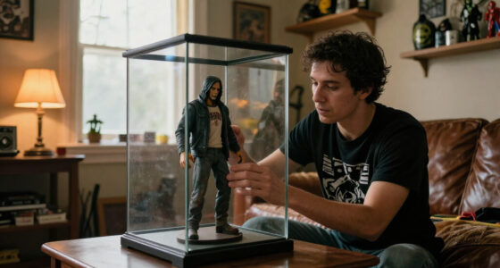
Place and test lights from your normal viewing position to catch glare before it becomes part of the display. Glass, glossy paint, glass eyes, and nearby windows can reflect even a carefully aimed fixture. A light that looks fine while you crouch beside the cabinet may shine straight back at you when you stand across the room.
Try moving a small light toward the cabinet’s side or top edge, then look through the glass from the doorway and from your usual seat. Diffused lighting along the top or sides can spread illumination more gently than a bare point of light. If a reflection lands over the face, change the angle or shift the lamp rather than adding more brightness.
Wires need a little planning too. Route them along the back or cabinet edge, and secure battery-powered lights so they cannot slide when you open a door. For instance, a rechargeable accent light sitting loosely on a shelf may tilt after a cabinet door closes; a small secure mounting point keeps the beam where you set it.
LED fixtures are commonly used for displays because they typically use relatively little power and produce less heat than many older lighting types. Still, check the fixture’s temperature and the manufacturer’s instructions, especially in an enclosed case. Keep ventilation clear, follow product guidance, and avoid placing a light where it rests against a figure or blocks airflow.
Pick lights that suit your cabinet and routine
Choose the fixture around your display’s power access, viewing angle, and desired control. Compact LED spotlights can suit one figure; strips can spread light across a shelf; battery or rechargeable accents can work where a cable would be awkward. Smart lights add remote control, schedules, or color changes, though not every display needs those features.
A small spotlight is easy to reposition when you rotate figures or change a pose. A strip light can make several figures equally visible, but a bare strip may reflect in cabinet glass or flatten the shadows. A dimmable fixture gives you room to adjust between a bright afternoon and a darker evening. Check current specifications for brightness, color temperature, dimming compatibility, power needs, and heat before choosing.
Imagine a collector with a glass cabinet against a wall and no outlet nearby. A battery-powered accent light might be convenient, while a wired strip could mean routing a cable around the cabinet. In another room, a powered spotlight may be simpler and easier to adjust. Convenience is part of a successful setup because a light you can reach is a light you’re more likely to tune.
Strong sunlight also deserves attention. Prolonged exposure can fade some materials and finishes, so note whether direct sun reaches the shelf during the day. A display that looks excellent at night may sit in a bright window each afternoon. Moving it out of direct sun can help protect its appearance over time.
Use these key facts to make the final adjustment
Keep one clear focal point, preserve the figure’s true colors, and check the view from where you actually enjoy the collection. Those three checks catch most display problems. A setup can look impressive in a close-up photo and still be hard to read from across the room.
Use the following quick comparison when you are deciding what to change. For example, if the face looks flat, try moving the key light to the side before adding a second lamp. If the figure looks vivid but its paint seems wrong, reduce the colored wash and return to a neutral light on the subject.
| What you see | Likely adjustment | Example |
|---|---|---|
| Flat face, little texture | Shift the key light off-center | Move the spotlight from straight ahead to the figure’s left |
| Paint looks heavily tinted | Use neutral white on the figure | Keep blue light behind the sculpt, not across its face |
| Details disappear in darkness | Add a soft fill or raise brightness slightly | Reveal the coat while keeping the backdrop dim |
| Bright reflection on glass | Change fixture angle or position | Move a top light toward the cabinet’s side |
Lighting is a small scene-building tool, much like a frame around a picture. It should direct your attention toward the sculpt and its defining details. If your eye keeps landing on the lamp, a colored strip, or a glare spot, simplify the arrangement and make the figure the center again.
Frequently Asked Questions
What color light makes a horror figure look scariest?
No single color works for every figure. Cool white can suggest moonlight, warm white can feel aged or candlelit, and a restrained red, green, or blue accent can set a genre mood. Keep a neutral light on the face if you want to preserve the paint and sculpt details.
Should I light a figure from above, below, or behind?
Start slightly above and off to one side for readable detail and useful shadows. Below lighting creates an unnatural look but can obscure the brow and chin; a dim backlight separates the silhouette from the background. Try each from your normal viewing position before settling on one.
How bright should display lighting be?
Use enough light to read the face and defining details without washing out the paint. A dimmer gives you control as room light changes. If you cannot dim the fixture, try changing its distance or aiming it toward a backdrop to soften the effect.
Are LED lights suitable for an enclosed display case?
LEDs are common for display lighting because they typically use relatively little power and produce less heat than many older lighting types. Check the fixture’s temperature and manufacturer guidance before placing it in an enclosed case. Keep ventilation open and secure both the light and its wiring.
How can I reduce glare on glass or glossy paint?
Test the light from the place where you usually view the cabinet. Move it toward a side or top edge, change its angle, or try diffused lighting if a bright reflection crosses the figure. A close-up inspection from beside the shelf may miss glare that appears when you stand across the room.
Will colored lighting change how my figure’s paint looks?
Yes, colored light can change the apparent color of paint and hide subtle sculpted details. A blue wash may make gray paint look blue, for example. Use a neutral key light on the figure and put stronger color behind it when you want both accurate detail and atmosphere.
Conclusion
Begin with one neutral light, aim it from slightly above and to the side, then adjust until the face and signature details read clearly. Add a colored backlight only if it strengthens the scene. Your display should hold its shadows like a quiet stage, with the figure still unmistakably in the spotlight.
Step back, check the view through the glass, and trust what you can actually see.